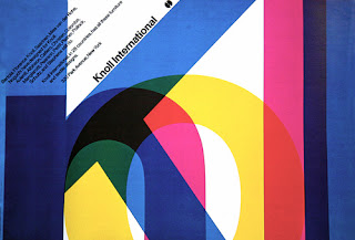
Wim Crouwell
I chose this piece out of all of Crouwell's work because it's use of colours caught my eye, I really like the way it's so compact on the page and yet because of the translucent layers, you can see the whole word.
This promotional design was created for fashion designer Anni Kuan, each piece showing her work in front of her favourite New York locations. I chose it because I like the simplicity of the black and white, and how two areas of design have merged to create a captivating newsprint catalogue.
Alan Fletcher
I chose the V&A sign mostly because I hadn't realised somebody would have gone out with the intent of designing it. When browsing some of Fletcher's designs there are many that are interesting and captivating, but this stood out the most to me, it's clean lines and accessibility as a logo.
I often think that white font on a colour or black background are the most bold and captivating, and that's why I chose this design. The textured background is such a tiny detail and yet really sets off the central image of layered colours.
I chose this book "In the News" because I really like the crossover of illustration and graphics, as this is something I'm quite interested in. I like how simple the image is, with the three colours, these are then reiterated on the opposite page, however this is quite simple, which really makes the image quite striking.
I really like the boldness of Bar's work. His designs stand out, I think, because of his use of only three colours. It isn't fussy or distracting, and the simple shapes outline the figure, then your imagination fills in the rest of it. I also like how he has used the Star Trek sign as the eye, linking it to the central image.


No comments:
Post a Comment