From my week in Graphic Design, I have come to see how it is incorporated into everyday life, from the font of my phone company to the layout of the magazines I'm reading. It has made me more aware of all the time and effort that goes into these. I think I've taken inspiration from most of the people that I've looked at, mainly because I hadn't really taken much notice of Graphic Design before, and all of the designers have different aspects of their work that interest me and that I will take on board. Editorial design is the discipline that I find most appealing, because I like seeing how pieces come together to create a page.
Sunday 11 November 2012


Graphic Designers

Wim Crouwell
I chose this piece out of all of Crouwell's work because it's use of colours caught my eye, I really like the way it's so compact on the page and yet because of the translucent layers, you can see the whole word.

This promotional design was created for fashion designer Anni Kuan, each piece showing her work in front of her favourite New York locations. I chose it because I like the simplicity of the black and white, and how two areas of design have merged to create a captivating newsprint catalogue.

Alan Fletcher
I chose the V&A sign mostly because I hadn't realised somebody would have gone out with the intent of designing it. When browsing some of Fletcher's designs there are many that are interesting and captivating, but this stood out the most to me, it's clean lines and accessibility as a logo.

I often think that white font on a colour or black background are the most bold and captivating, and that's why I chose this design. The textured background is such a tiny detail and yet really sets off the central image of layered colours.

I chose this book "In the News" because I really like the crossover of illustration and graphics, as this is something I'm quite interested in. I like how simple the image is, with the three colours, these are then reiterated on the opposite page, however this is quite simple, which really makes the image quite striking.

I really like the boldness of Bar's work. His designs stand out, I think, because of his use of only three colours. It isn't fussy or distracting, and the simple shapes outline the figure, then your imagination fills in the rest of it. I also like how he has used the Star Trek sign as the eye, linking it to the central image.
Dalton Maag


Browsing the Design Museum London I came across Dalton Maag 'experts in type design', who have worked with firms such as BMW, McDonalds, and Nokia, designing and updating their type.
Applied Arts - contextual studies
Nora Fok is an artist whose work is based mainly on the ever changing aspects of nature, structure, systems and order. Her pieces are very complicated, reiterating the complexity of the item she has based her work upon. The items Fok creates range from neckpieces and bracelets to an armadillo hood, based on the Clyde Auditorium in Glasgow.
Some of Fok's work does not appeal to me, because of the garish colours and the way the are presented, for example 'Veil' which I am not a fan of, mainly because it differs from her work inspired by nature and the environment.

My favourite pieces of her work are those that are based on water or moisture.


This is because she has managed to create something so small and delicate that really reflects bubbles/the morning dews quality. Her ability to knit with nylon is extensive, and some of the rings and neck pieces are vast, which must have taken hours and hours to create. I really admire her use of these materials because it reiterates the fact she's making something based on nature, as all of the items she has taken inspiration from were knitted together themselves. I don't feel that Fok's work has any shortcomings, because her clear knowledge of knitting with nylon shows how she can manipulate the shapes, so that hardly any two items look the same.
I feel that perhaps a lot of her work, even though it is often displayed as wearable is slightly impractical. It would perhaps be better if it were shown in a gallery, which would make it exclusive. I also think that because the pieces are so complicated, it's obvious they take many hours to create, which means the price of the item must be quite expensive to make up for the materials and time she has used.
.JPG)
3D & Spatial Design

I chose to look at the Haus am Horn, as it was designed by the youngest master of the Bauhaus, George Muche. The house was a prototype for the Bauhaus's ideas on residential living; the interiors, house's structural design and even the constructor were all part of the Bauhaus. I think the building impacted on me because it is so bold. The clean lines caught my eye as it looks quite modern, even though it was built in 1923. I find it very interesting, however, am not entirely sure whether I like it, I think this is because for a house, it doesn't look very homely, and it could look quite unwelcoming and cold in a different light of day.
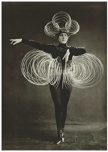
Oskar Schlemmer, also a member of the Bauhaus created the Triadic Ballet and all it's costumes. I feel this is quite an important part of the Bauhaus history because whilst the ballet toured, it was helping to spread the ethos of the Bauhaus. I chose this particular image because it's so striking. The costume of coils appears very modern, and looks quite odd on this lady from the 1920s. I quite like this element of it, the lady isn't really part of the costume, just a convenient way to display it, and as she is dressed in black, this really lets the coils stand out.

I chose to look at Zaha Hadid as I have become aware of how successful her work is, because of her involvement in the Olympic Games. The buildings she creates often have multiple perspective points, which make them appeal from every angle with the design of the building allowing them to fit in with the surrounding location and yet stand out and be bold at the same time. The recurring theme in most of her creations are curves, this really breaks up the formality of square/rectangular buildings and quite often allows for her buildings to appear sculptural in their design. Hadid became the first woman to win the Pritzker Prize for Architecture because of her "radically new approach to architecture by creating buildings to evoke the chaos of modern life."

Thomas Heatherwick's Autumn Intrusion of Harvey Nichols is one project that really caught my eye. I really love the way he has taken such an established well known, traditional firm and used their renowned window displays to create a piece that incorporates the building and windows as a whole. I'm also drawn to the 3D aspect of the work, how it breaks through the windows and is winding it's way through the walls and windows.

Viktor & Rolf have been creating sculptural dresses since their first couture show in 1998. The structure and striking nature of the dresses has remained the same, however in more recent shows, the dresses have flattered the bodies whilst creating volume. This is really emphasized in the dresses shown, they have taken on a sculptural quality because of the cutout sections, which will allow the different sections to move independently, giving a once rigid dress fluidity and movement.


Viktor & Rolf have been creating sculptural dresses since their first couture show in 1998. The structure and striking nature of the dresses has remained the same, however in more recent shows, the dresses have flattered the bodies whilst creating volume. This is really emphasized in the dresses shown, they have taken on a sculptural quality because of the cutout sections, which will allow the different sections to move independently, giving a once rigid dress fluidity and movement.
After looking at Fred Baier's work, I have come to the conclusion that I'm not a fan. This is because I feel that his use of colours and shapes, makes me feel that his work is quite child like, as some of the shapes give them an innocent childlike quality. I know this isn't the case with some of his work, but the strict harsh lines and rigid shapes gives me the impression that the work is constrained within the lines.
Subscribe to:
Posts (Atom)