Looking at Woodman's work I found it quite dark and melancholy, a lone figure in a decaying room. What I did find interesting about her work though is that she only photographs herself. In this image she is protected and camouflaged by the wallpaper, and the pattern is striking against the grey wall.
Sunday, 23 September 2012
Robert Capa
I find this image by Capa so striking because of the silhouette of the people on the fair ground ride. Their dark forms really stand out against the grey background and you get a sense of movement from the larger figures as they are slightly out of focus.
Richard Avedon
Out of all the photographers I've looked at I think Richard Avedon is my favourite. This is image of artist Marc Chagall caught my eye because of the composition, his stance reflects that of the Eiffel Tower, as does the man's that we can see through his legs. I also really like the way that Chagall is taller than the tower, he dominates the photograph.
Saturday, 22 September 2012
Simon Roberts
I find this image by Roberts striking because of the tranquil serenity of the foreground, with the swans, is then juxtaposed with the roller coasters in the background. The colours are quite muted and bleak and despite the grass banks and the river taking up most of the image, your eye is always drawn back the roller coaster.
William Eggleston
I really like this image by Eggleston, I think it's the way the light from the sign emphasises the man sitting at the piano. Also the juxtaposition of the piano being in the car park of 'Memphis's best bar', which probably isn't renowned for playing classical music, which is usually what a grand piano signifies.
Martin Parr
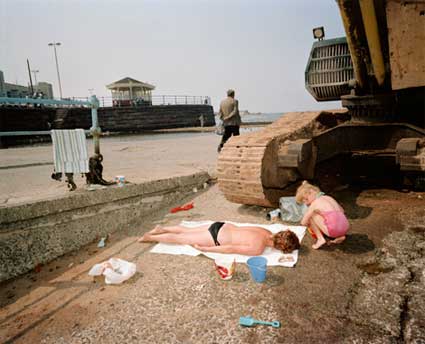
I find out of all the images from Parr's book 'The Last Resort' I was drawn to this one the most. I think it's the juxtaposition of the little girl playing with her buckets and spades, in front of what looks like some heavy machinery. Her innocence of creating something, whilst the machinery is most often associated with destruction.
Annie Leibovitz
The lines in this image makes your eyes flow down the image, rather than just looking at one aspect of it. I really like the way the clouds are faintly reflected in the wet sand, it makes the men look as though they are floating.
Carrie Mae Weems
I'm really attracted to this image by Weems because of the way the house appears to be framed by the branches of the trees in the foreground. Your eye is then drawn to the lady sitting in the shadow of the tree just off centre, which gives the image depth.
William Klein
I don't really like this image, but find the way Klein has captured the movement of the children very interesting. Even though the image is slightly blurred you can see that their dancing and joyfulness is a contrast to the rigid bleak background.
Dorothea Lange
I think in this image, it shows how appearances are deceptive. The children, of migrant workers, are protected by the shadow of the tree. I really like the little boy peeking out from behind the tree and that in the background of the image you can see the huts where they may live.
Henri Cartier Bresson
I am captivated by this because of the different levels of the people in the composition, your eye is easily drawn throughout the image.
Robert Doisneau
I really like how Doisneau has focused on the couple kissing, the world around them keeps moving and yet they are the centre of each others universe. The background is quite faded and blurry and some of the people that walk around them are blurred, whilst the central image of the couple is strong and in focus.
Sunday, 16 September 2012
Introduction to Illustration
Flicking through magazines and seeing the variety of cards on display in shops I have come to see that illustration surrounds me in my everyday environment. When I started this week I didn't realise that illustration was used over such a broad spectrum of media, from court illustrations to websites and advertising, and I have definitely become more aware of this.
By using a stick and ink to draw, I have learnt that the key tools of an illustrator aren't always confined to a pencil or pen, and have rather taken to using my left hand to draw instead of my right, as the end image isn't as controlled and the lines are more fluid.
Researching artists, I have found that Izziyana Suhaimi and David Downton have inspired me to experiment more, with different materials, and to not be too controlled. Downton's work has shown me that a full outline isn't always needed to portray what you're drawing, as colours and small suggestive lines will let your mind create what isn't there. And Suhaimi has made me see that by adding colour in the form of embroidery to a pencil drawing, it can bring more life and vibrance to a piece.
I think that within illustration, I find fashion illustrations the most interesting and captivating, and something I would perhaps like to have a more in depth look at. This is because the way outfits and pieces are portrayed by the artist, it makes them look really elegant, I especially love the way watercolours and inks are used to capture movement in the illustrations.
I think that within illustration, I find fashion illustrations the most interesting and captivating, and something I would perhaps like to have a more in depth look at. This is because the way outfits and pieces are portrayed by the artist, it makes them look really elegant, I especially love the way watercolours and inks are used to capture movement in the illustrations.
Illustration Magazine
I chose this article from an old copy of Illustration Magazine as I found it incredibly interesting how Chris Riddell, a children's illustrator and newspaper cartoonist, uses many different styles of illustration, from contemporary gothic to being inspired by Golden Age illustrators and Edwardian fantasy classics. I am also intrigued by how the series of books which has become so popular started with one of Riddell's drawings of a map, and how enough material for ten books has spanned from that. This is helped by Riddell's use of sketchbooks, as he has dedicated some specially to the characters and places used in the book. This has inspired me to keep a sketchbook with me at all times, to document what surrounds me, as you never know what you might end up using it for.
Friday, 14 September 2012
Tom Gauld
This image created by Tom Gauld is very simple, the way he has used muted colours makes it more striking, as the small details such as the lines in the grass and the reflection on the bottle stand out more. I think the drawing appears to be a little cartoony and flat, however am quite drawn to that quality of it.
Michael Gillette
Michael Gillette's usual style of drawing uses bright colours and is often related more to the popular culture, with covers created for books and cd cases. I think this is what drew me to this image when I first saw it, that it was quite different to his other works. To begin with it's his use of the eery green colour throughout the composition, and the way the bare trees look quite skeletal. The lonely, decrepit boat in the middle of the image captures your attention because it is so detailed compared to it's surroundings, and this is then reiterated by it's reflection. I really like the contrast between the controlled drawing of the boat and then the free, loose trees in the background.
Luke Best
Creating his drawings using cut out bits of paper, amongst other mediums, Luke Best's images appear flat and 2D, but by layering different colours to create shadows and patterns it provides the images with more depth. I find the way he hasn't used an outline on any of the objects interesting, however don't feel that they need one as the colours stand out on their own.
Thursday, 13 September 2012
Olivier Kugler
Olivier Kugler works directly from life or reference pictures he's taken himself. I find the way he has layered the image very interesting, as the varied lines of the reef and fish seem to overflow off the background colour of the sea. Some of the fish appear to be unfinished with small parts of their body coloured in, and the rest just an initial outline, which I think draws your eye to them. Kugler also uses text and arrows to highlight key parts in his drawings, which rather than just glancing over them makes us take time to actually look what he's showing us.
Lucinda Rogers
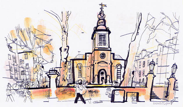
The use of varying lines in Lucinda Rogers's pen, ink and watercolour drawings is wonderfully simplistic and yet she manages to create pieces that appear layered and full of detail. The thicker outlining pen creates the illusion that the church, wall and trees are closer to you, with the buildings and trees created using a thinner pen are all part of the layers that build up the picture's background. The colour she has used doesn't dominate the picture, but adds to the depth of it.
Izziyana Suhaimi
I really find these drawings by Izziyana Suhaimi captivating because of the intricate detail, the way she has paid close attention to the strands of hair in the plaits by using varying lines and tone of a pencil, and then adding in watercolours which stand out against the grey and white. Embroidery is then incorporated into the drawing in complementing colours and patterns.
Tuesday, 11 September 2012
Sara Fanelli - illustration
After researching various illustrators, I found this press advert by Sara Fanelli. I think the colours in this Orange advert are quite warm and instantly caught my eye, as the bright colours are a contrast to the white background. I especially like the way the key words in the advert are highlighted by being bolder and in a different style to the other text. The image and its text makes me feel really uplifted and happy.
Subscribe to:
Posts (Atom)


